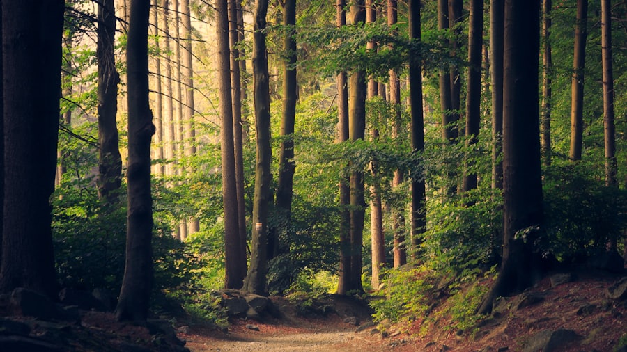
Old pines and a path that goes soft underfoot. Light arrives late here and leaves early, so the whole floor stays green.
Gooey Tabs
Tabs that pour: the active pill and panel share one SVG goo filter, so they fuse into a liquid neck that stretches and snaps as the pill slides.
A free, copy-paste navigation menus component for React, Next.js — built with Tailwind CSS, installable with the shadcn CLI.
Configuration
Tweak these live from theConfigurecontrol in the preview.
Interaction Type
- Click a tab — the pill pours across and fuses with the panel
- Hovering an inactive tab lifts a soft plate behind it
- Arrow keys move between tabs
Dependency
No dependencies — plain React. Just drop the file in.
Point the CLI here once
A namespace is a local alias, so the CLI has to be told what @harshdev-ui resolves to. One command, once per project:
npx shadcn registry add "@harshdev-ui=https://ui.harshpandav.dev/r/{name}.json"After that every component installs by name. To skip it entirely, pass the URL straight to the CLI — shadcn add https://ui.harshpandav.dev/r/gooey-tabs.json — or copy the file from Source code below.
[ shadcn CLI 3.0 registry ]…or add the component in one command
Install via CLI
pnpm dlx shadcn add @harshdev-ui/gooey-tabsHow to use
Give Gooey Tabs a list of tabs — a label and whatever content each should show — and it renders a strip with the panel beneath. Click a tab, or move with the arrow keys; the pill pours across and the panel comes with it.
The whole effect is two plain rectangles — the pill and the panel — sharing one SVG goo filter. Where they meet the filter welds them into a neck that stretches as the pill travels and snaps once it arrives, and the same filter rounds every corner, so no border-radius is declared anywhere. Sliding is one CSS transform transition, so nothing animates in JavaScript.
Basic usage
import { GooeyTabs } from "@/components/harsh-ui/gooey-tabs";

const tabs = [
  { label: "Forest", content: "Old pines and a soft path underfoot.", image: "/tabs/forest.jpg" },
  { label: "Ocean", content: "Cold water and a long swell.", image: "/tabs/ocean.jpg" },
  { label: "Desert", content: "Dunes that rewrite themselves overnight.", image: "/tabs/desert.jpg" },
];

const Demo = () => <GooeyTabs tabs={tabs} className="w-full max-w-xl" />;
Thicker goo, slower pour
// a longer neck that takes its time before snapping
<GooeyTabs tabs={tabs} gooeyness={13} effect="elastic" speed={0.7} tabHeight={56} />
Your palette
<GooeyTabs
  tabs={tabs}
  surface="#ffffff"
  frame="#0d0d0f"
  accent="#0d0d0f"
/>
Demo
import { GooeyTabsDemo } from "@/components/demos/gooey-tabs-demo";

const Demo = () => (
  <div className="h-screen w-full">
    <GooeyTabsDemo />
  </div>
);
Props
Notes
- The pill and the panel are two untouched rectangles — no border-radius anywhere. Blurring their alpha and slamming it through a steep feColorMatrix ramp rounds every corner and welds the two shapes wherever they overlap, which is the whole effect.
- feComposite with operator="atop" paints the original crisp rectangles back over the gooey result, so the pill and panel keep hard edges while only the join between them stays liquid.
- The pill stretches while it travels — a scaleX kick that settles on arrival — which is what drags the goo into a visible neck rather than sliding cleanly under it. Both that and the slide are one composited CSS transform; nothing animates in JavaScript.
- The filter id comes from useId(), so two sets of tabs on one page can't both answer to the same #goo and cancel each other out.
- Proper tablist semantics rather than the radio-input trick the effect is usually built on: role=tablist/tab/tabpanel, aria-selected, roving tabindex and arrow-key navigation.
- The goo ramp binarises alpha, so a translucent fill would just be pushed back to solid. Glass mode instead frosts the plate with backdrop-filter and drops the opacity of the filtered result, which keeps the gooey silhouette while letting the background through.
- Only the weld is filtered. The goo runs in a shallow band across the tab strip while the rest of the panel is a plain rectangle of the same colour, so sliding never re-rasterises the whole card — which is what an SVG filter over a full-height panel with an image in it would otherwise cost every frame.
- Inactive labels pick their own colour from the frame's lightness, so a pale frame gets dark labels and a dark one gets light labels without another prop.
- Under prefers-reduced-motion the pill jumps straight to the tab instead of pouring.
- The goo technique is a long-standing CSS trick — the tab arrangement here follows a CodePen by lecomtejeanbaptiste. The React port, the tablist semantics, the configurable geometry and the palette props are this version's.
Source code
The complete gooey-tabs.tsx — toggle TSX / JSX to copy it in either language.
"use client";
import { useCallback, useEffect, useId, useRef, useState, type ReactNode } from "react";

/**
 * Harsh Dev UI · Developed by Harsh Pandav
 * https://harshpandav.dev · hello@harshpandav.dev
 *
 * GooeyTabs
 * Tabs that pour. The active pill and the panel beneath it are two plain
 * rectangles living inside one SVG goo filter, so where they meet the filter
 * fuses them into a liquid neck that stretches and snaps as the pill slides —
 * and the same filter is what rounds their corners, so no radius is declared
 * anywhere. Sliding is a single CSS transform transition: no animation loop,
 * no per-frame work, nothing for React to re-render but the panel copy.
 */

export type GooeyTabsEffect = "spring" | "smooth" | "snappy" | "elastic";

/** each effect carries its own curve, base timing and how hard the pill stretches */
const EFFECTS: Record<GooeyTabsEffect, { ease: string; ms: number; pull: number }> = {
  spring: { ease: "cubic-bezier(.34,1.32,.5,1)", ms: 420, pull: 1.16 },
  smooth: { ease: "cubic-bezier(.22,1,.36,1)", ms: 380, pull: 1.07 },
  snappy: { ease: "cubic-bezier(.5,0,.2,1)", ms: 230, pull: 1.22 },
  elastic: { ease: "cubic-bezier(.5,1.9,.4,1)", ms: 560, pull: 1.3 },
};

export type GooeyTab = {
  label: string;
  content?: ReactNode;
  image?: string;
};

export type GooeyTabsProps = {
  tabs: GooeyTab[];
  defaultIndex?: number;
  gooeyness?: number;
  tabHeight?: number;
  surface?: string;
  frame?: string;
  accent?: string;
  glass?: boolean;
  effect?: GooeyTabsEffect;
  /** 0.5\u00d7\u20132\u00d7 multiplier on the effect\u0027s own timing */
  speed?: number;
  autoPlay?: boolean;
  className?: string;
};

const clamp = (v: number, lo: number, hi: number) => Math.min(hi, Math.max(lo, v));

/** rough perceptual lightness, for picking a legible label colour on any frame */
const luma = (hex: string) => {
  const h = hex.replace("#", "");
  const f = h.length === 3 ? h.split("").map((c) => c + c).join("") : h;
  const n = parseInt(f, 16);
  if (Number.isNaN(n) || f.length !== 6) return 0;
  return (0.299 * ((n >> 16) & 255) + 0.587 * ((n >> 8) & 255) + 0.114 * (n & 255)) / 255;
};

const alpha = (hex: string, a: number) => {
  const h = hex.replace("#", "");
  const f = h.length === 3 ? h.split("").map((c) => c + c).join("") : h;
  const n = parseInt(f, 16);
  if (Number.isNaN(n) || f.length !== 6) return hex;
  return `rgba(${(n >> 16) & 255}, ${(n >> 8) & 255}, ${n & 255}, ${a})`;
};

export function GooeyTabs({
  tabs,
  defaultIndex = 0,
  gooeyness = 8,
  tabHeight = 48,
  surface = "#f2f6fa",
  frame = "#5d8bb3",
  accent = "#17364f",
  glass = false,
  effect = "spring",
  speed = 1,
  autoPlay = false,
  className = "",
}: GooeyTabsProps) {
  const N = tabs.length;
  const fx = EFFECTS[effect] ?? EFFECTS.spring;
  const duration = Math.round(fx.ms / clamp(speed, 0.4, 2.4));
  // how far past the strip the filter has to reach for the weld to resolve
  const weld = Math.round(gooeyness * 2);
  const band = tabHeight + Math.round(gooeyness * 4);
  const radius = Math.round(gooeyness * 1.5);
  const idle = luma(frame) > 0.58 ? alpha(accent, 0.5) : "rgba(255,255,255,0.85)";
  const [active, setActive] = useState(clamp(defaultIndex, 0, N - 1));
  const [moving, setMoving] = useState(false);
  const [reduce, setReduce] = useState(false);
  const gooId = `goo-${useId().replace(/:/g, "")}`;
  const stripRef = useRef<HTMLDivElement>(null);
  const stretch = useRef<ReturnType<typeof setTimeout> | undefined>(undefined);

  useEffect(() => {
    const mq = window.matchMedia("(prefers-reduced-motion: reduce)");
    const update = () => setReduce(mq.matches);
    update();
    mq.addEventListener("change", update);
    return () => mq.removeEventListener("change", update);
  }, []);

  useEffect(() => () => clearTimeout(stretch.current), []);
  const bump = useCallback(() => {
    if (reduce) return;
    setMoving(true);
    clearTimeout(stretch.current);
    stretch.current = setTimeout(() => setMoving(false), duration * 0.5);
  }, [duration, reduce]);

  const select = useCallback(
    (i: number) => {
      setActive(i);
      bump();
    },
    [bump],
  );

  useEffect(() => {
    if (!autoPlay) return;
    const id = setInterval(() => {
      setActive((i) => (i + 1) % N);
      bump();
    }, 2200);
    return () => clearInterval(id);
  }, [autoPlay, N, bump]);

  const onKey = useCallback(
    (e: React.KeyboardEvent) => {
      const d = e.key === "ArrowRight" ? 1 : e.key === "ArrowLeft" ? -1 : 0;
      if (!d) return;
      e.preventDefault();
      const next = (active + d + N) % N;
      select(next);
      stripRef.current?.querySelectorAll("button")[next]?.focus();
    },
    [active, N, select],
  );

  const slide = reduce
    ? "none"
    : `translate ${duration}ms ${fx.ease}, scale ${Math.round(duration * 0.42)}ms cubic-bezier(.3,0,.2,1)`;

  return (
    <div className={`relative isolate ${className}`} style={{ color: accent }}>
      <svg aria-hidden className="absolute h-0 w-0">
        <defs>
          <filter id={gooId} colorInterpolationFilters="sRGB">
            <feGaussianBlur in="SourceGraphic" stdDeviation={gooeyness} result="b" />
            <feColorMatrix
              in="b"
              type="matrix"
              values="1 0 0 0 0  0 1 0 0 0  0 0 1 0 0  0 0 0 19 -9"
              result="goo"
            />
            <feComposite in="SourceGraphic" in2="goo" operator="atop" />
          </filter>
        </defs>
      </svg>

      <span
        aria-hidden
        className="pointer-events-none absolute -inset-4 rounded-3xl"
        style={
          glass
            ? {
                background: alpha(frame, 0.28),
                backdropFilter: "blur(22px) saturate(1.7)",
                WebkitBackdropFilter: "blur(22px) saturate(1.7)",
                boxShadow:
                  "inset 0 1px 0 rgba(255,255,255,0.35), inset 0 0 0 1px rgba(255,255,255,0.2), 0 24px 60px -24px rgba(0,0,0,0.55)",
              }
            : { background: frame }
        }
      />

      <span aria-hidden className="pointer-events-none absolute inset-0" style={{ opacity: glass ? 0.46 : 1 }}>
        {/* Only the weld needs filtering. Keeping the goo to a shallow band keeps
            the blur off the panel — and off any image in it — so sliding never
            re-rasterises the whole card. */}
        <span
          className="absolute inset-x-0 top-0 overflow-hidden"
          style={{ height: band, filter: `url(#${gooId})`, color: surface }}
        >
          <span className="absolute inset-x-0 bottom-0 bg-current" style={{ top: tabHeight }} />
          <span
            className="absolute left-0 top-0 bg-current"
            style={{
              width: `${100 / N}%`,
              height: tabHeight,
              // separate CSS properties: resetting the stretch must never
              // restart the in-flight slide, which is what made it jolt
              translate: `${active * 100}% 0`,
              scale: `${moving ? fx.pull : 1} 1`,
              transition: slide,
              willChange: "translate, scale",
            }}
          />
        </span>
        <span
          className="absolute inset-x-0 bottom-0 bg-current"
          style={{ top: tabHeight + weld, color: surface, borderRadius: `0 0 ${radius}px ${radius}px` }}
        />
      </span>

      <div
        ref={stripRef}
        role="tablist"
        onKeyDown={onKey}
        className="relative z-10 flex items-stretch"
        style={{ height: tabHeight }}
      >
        {tabs.map((t, i) => (
          <button
            key={t.label}
            type="button"
            role="tab"
            aria-selected={i === active}
            tabIndex={i === active ? 0 : -1}
            onClick={() => select(i)}
            className="group relative flex-1 cursor-pointer text-sm font-medium transition-colors sm:text-base"
            style={{ color: i === active ? accent : idle }}
          >
            <span
              aria-hidden
              className="pointer-events-none absolute inset-1 rounded-xl bg-black/10 opacity-0 transition-opacity group-hover:opacity-100 group-aria-selected:opacity-0"
            />
            <span className="relative">{t.label}</span>
          </button>
        ))}
      </div>

      <div
        role="tabpanel"
        key={active}
        className="relative z-10 p-4 sm:p-5"
        style={{ animation: reduce ? undefined : `goo-in ${duration + 120}ms cubic-bezier(.22,1,.36,1) both` }}
      >
        <p className="text-sm leading-relaxed sm:text-[0.95rem]">{tabs[active]?.content}</p>
        {tabs[active]?.image && (
          <img
            src={tabs[active].image}
            alt=""
            className="mt-4 h-44 w-full rounded-2xl object-cover sm:h-60"
          />
        )}
      </div>

      <style>{`@keyframes goo-in{from{opacity:0;transform:translateY(9px)}to{opacity:1;transform:none}}`}</style>
    </div>
  );
}
Keep in mind
Some components here are recreations of the best interactions out there. I don't claim to be the original creator — this is my attempt to study, replicate, and often add a few extra features. I've tried to credit everyone; if I missed something, let me know.
Contact
Found a bug or an issue? Drop a mail — hello@harshpandav.dev
License & Usage
- Free to use and modify in personal and commercial projects.
- Attribution to Harsh Dev UI is appreciated but not required.
- MIT licensed.